Review: The Ultimate Hacking Keyboard
28 Oct 2015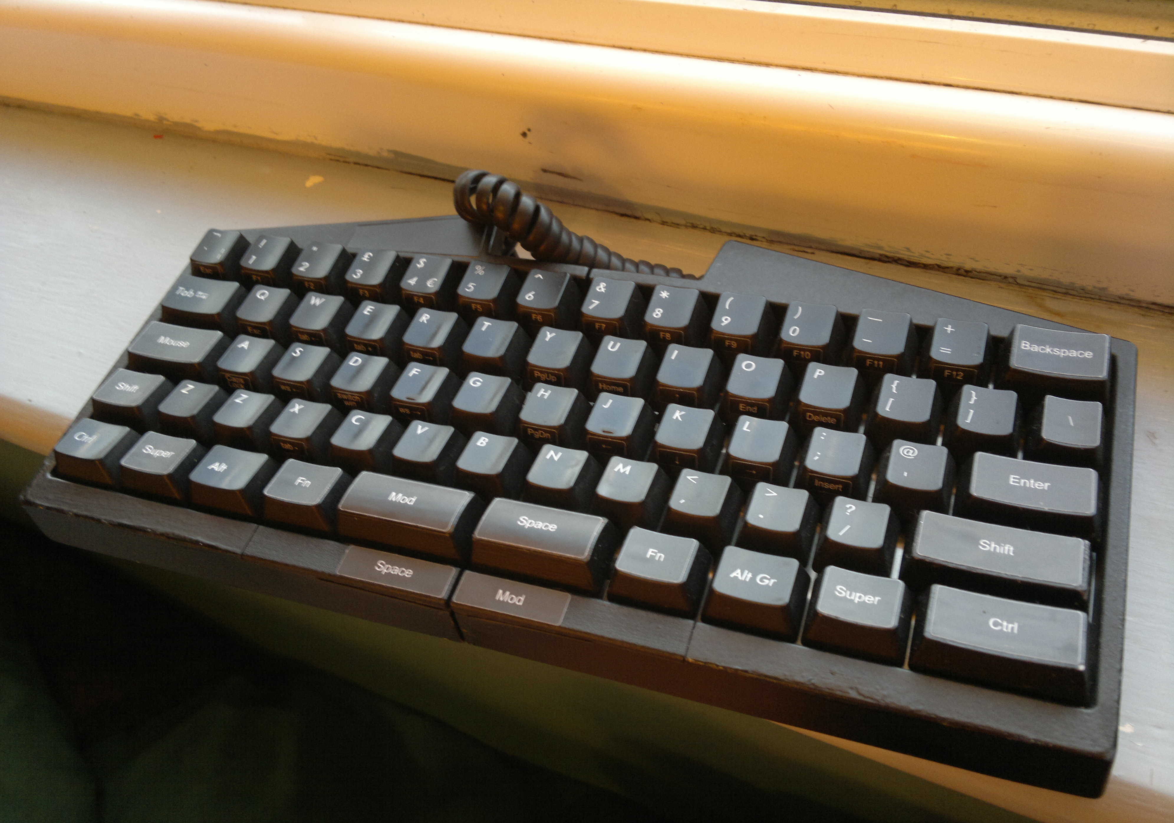
Now with the launch of the UHK’s funding campaign (live and available on crowdsupply). I will share my experience with the test unit I received a couple of weeks ago. I was given one of the few units they had at the time. It was not completely like the finished product and was missing some features, this is why I have mentioned the fact it is a test unit. Despite the fact that it is a test unit I can already say that I was not disappointed even at this prototype stage. It was a prototype with some elements missing, it showcased what was and what could be the potential of the product.
I had two weeks to test it and I tried to use it as much as possible. One measured way I have tested it is through the minimum of 20 typing tests per day (I am fairly certain I reached this goal). I received the ISO version that featured a half ISO layout. I was very happy with this as I much prefer the ansi enter. More information on the ansi and iso design decisions here
From the start of my discovery of the UHK’s existence I was quite excited about it. There are not a huge amount of split 60% keyboards available. I can currently think of none that are available to purchase.(maybe the utron). It promised a lot with the seamless join in the middle as well as being sturdy but also having some additional functions such as the mouse layer and led panel. In this current state that I got to test not all of these features are present. But it does somehow manage to live up to the interest I first garnered.
Design
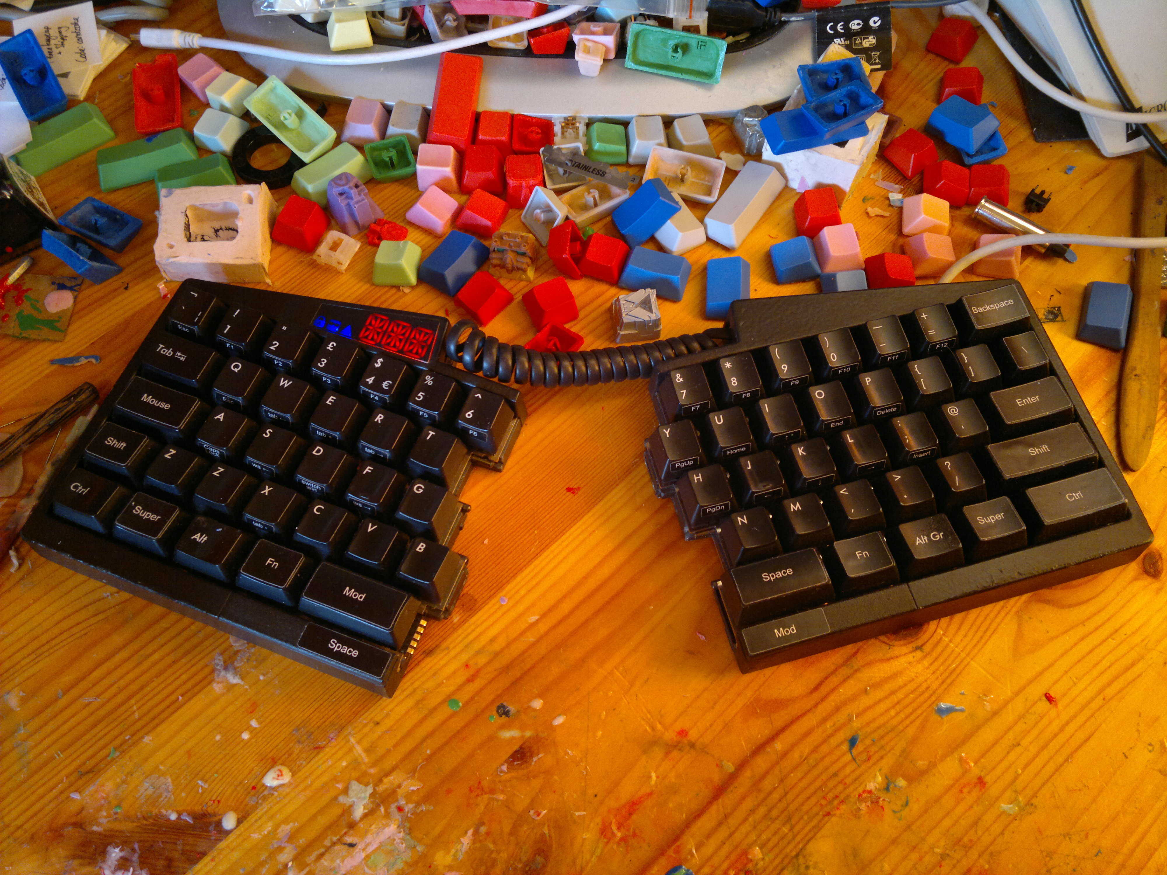
I think the main reason is the well crafted layout both hardware and software side. One concept I keep coming back to on the description of the UHK, is the great unity between the hardware and the software design. I mean the software layout seems to have been designed to the hardware layout to make it the best combination possible. It seems neither the software layout or the hardware layout have compromised to make this happen.
It is very easy to use extended layers to make the perfect keyboard that is tailored to yourself. You can have many layers within layers and dual role keys that may be what you want but may not work for someone else. I think the UHK has created a simple layout that may be a little easier to use out of the box and this makes the adoption of a keyboard like the UHK easier for those who might be intimidated by the 60% nature or even the split nature. One example of this is the spacebar that is present on both hands. This essentially gives you a more standard spacebar experience, but it encourages you to use the space on the right as that is on the bottom row not the case row.
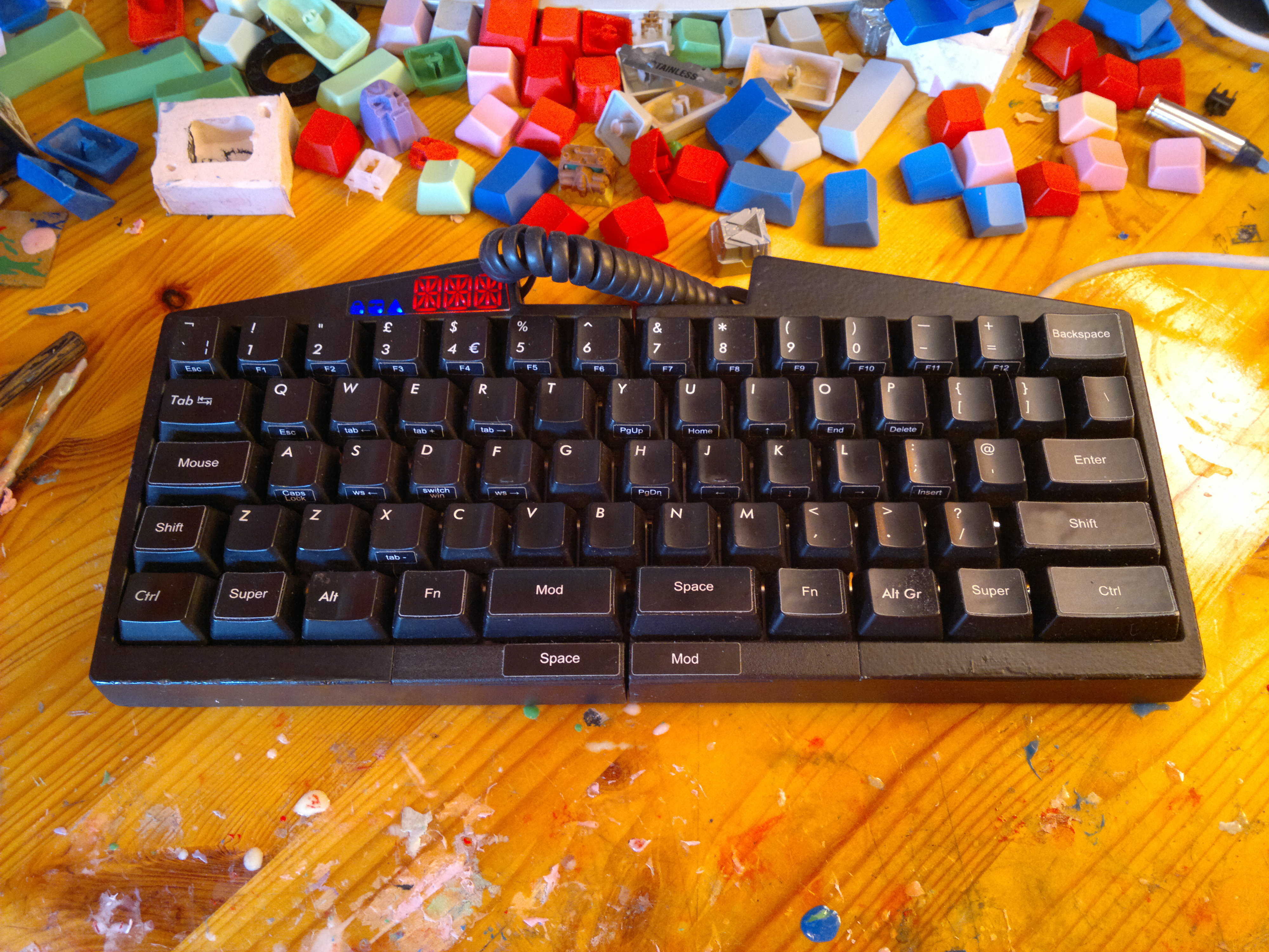
The UHK works great out of the box I found this was particularly apparent by both of the thumb buttons on each hand. Both hand has access to a mod and a space. I type very traditionally with only the use of my right thumb on spacebar. I am not a proprietor of left space usage, But whenever I used it in vim as my leader key I would use my left. Initially I was thrown off by the mod being more prominent on the left hand but the access to the space made this problem go away. The access here is given through the additional buttons that are on the rim of the case.
I have quite a strict set of keyboard layout rules that I usually use across all keyboards that let me do it. The UHK forced me to have control in the bottom right, where it would usually be in place of capslock. This transition was not bad as I was really enjoying using the mouse button which are activated through the capslock position key. I applaud this disregard of capslock as it really opens up the possibilities.
One other favourite part of the layout is the easy access to both the mouse keys and arrow keys. I love the position of the arrow keys on the HHKB as it is not at all hard to move your hands to them when typing, unlike a TKL layout where I really have to disrupt my typing. The UHK takes this further as you have access to the arrows with the help of either thumb. They are also on the home row so you move even less. This works in a similar way for the mouse layer. If there is only one thing I will take away from testing the UHK, it is the viability of mouse buttons.
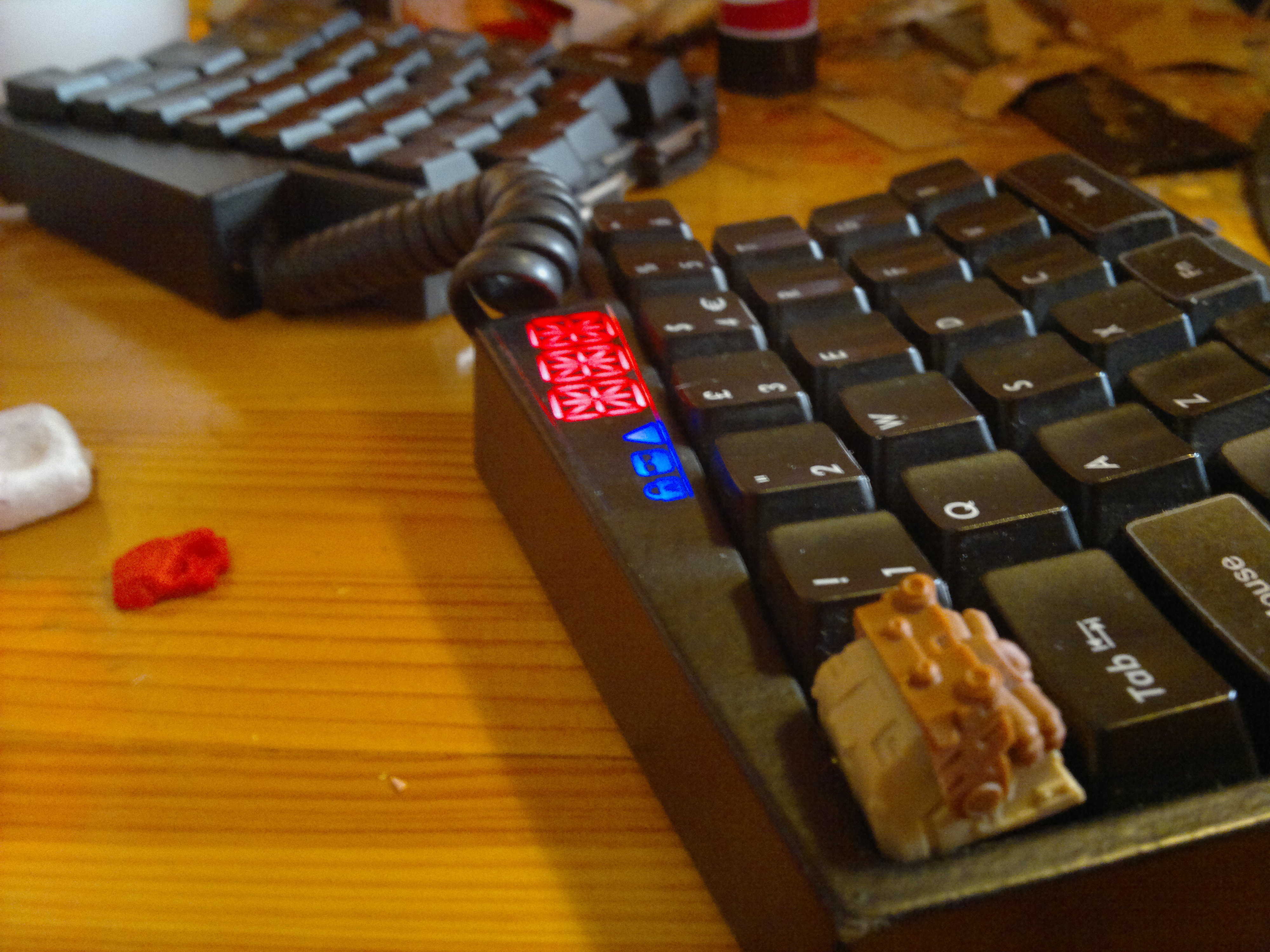 Looking nice with a Hot Keys Project Woodland Raven
The build of this prototype was also impressive. This is a little inconsequential as the finished product will not be exactly like this but It represents the work that has got in. Most of the case I believe was 3d printed as well as some keycaps. I didn’t really feel any detrimental effect of either of these aspects. But I am really looking past the keycaps on the prototype.
Looking at the keyboard there is not much too it. It’s joined by a ‘phone cable’ (not quite sure on the namee) that gives you a lot of length to split it apart. It has a small body with not too much bezel or wasted space around the edges and the top contains the LED panel. The prototypes LED panel was just a red LED so it was not functioning. This panel will become more useful if you are using more of your own custom firmware with more complicated layer structures. But it was fine to type on it without it.
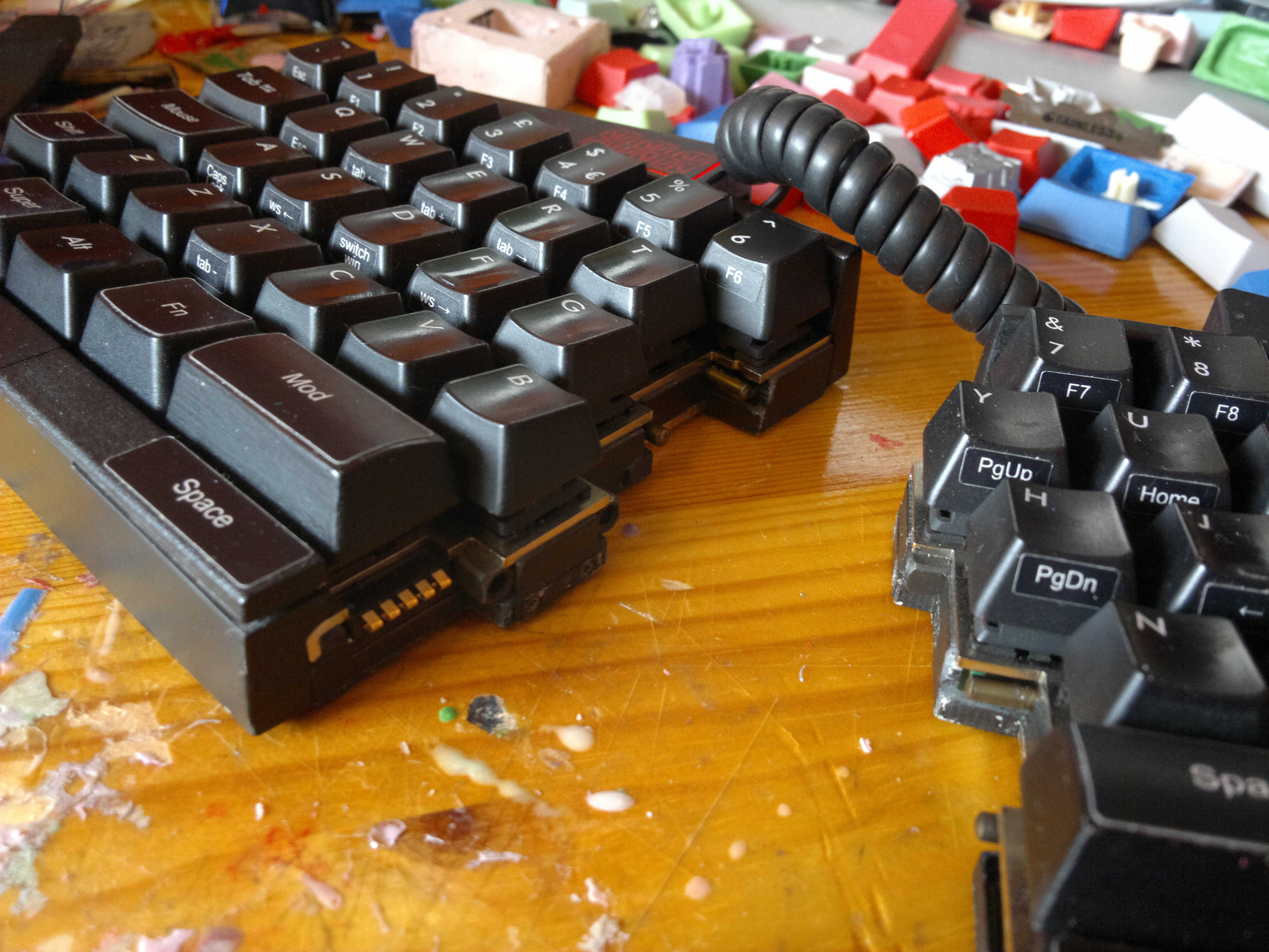
At the heart of the UHK is the ability to be a split and not-split (I’m not sure of what term should be used) 60%. It really sets it apart and gives it a feature and look that I have not seen before. My first time pulling apart the UHK was very strange as I was not expecting the sturdiness at all. It feels like solid metal. Magnets hold it in perfectly to the point where they easily come apart but you feel like there is real weight behind them. You will not find yourself slowly sliding apart as you are typing as they do not come apart without manual intervention.
The Dojo
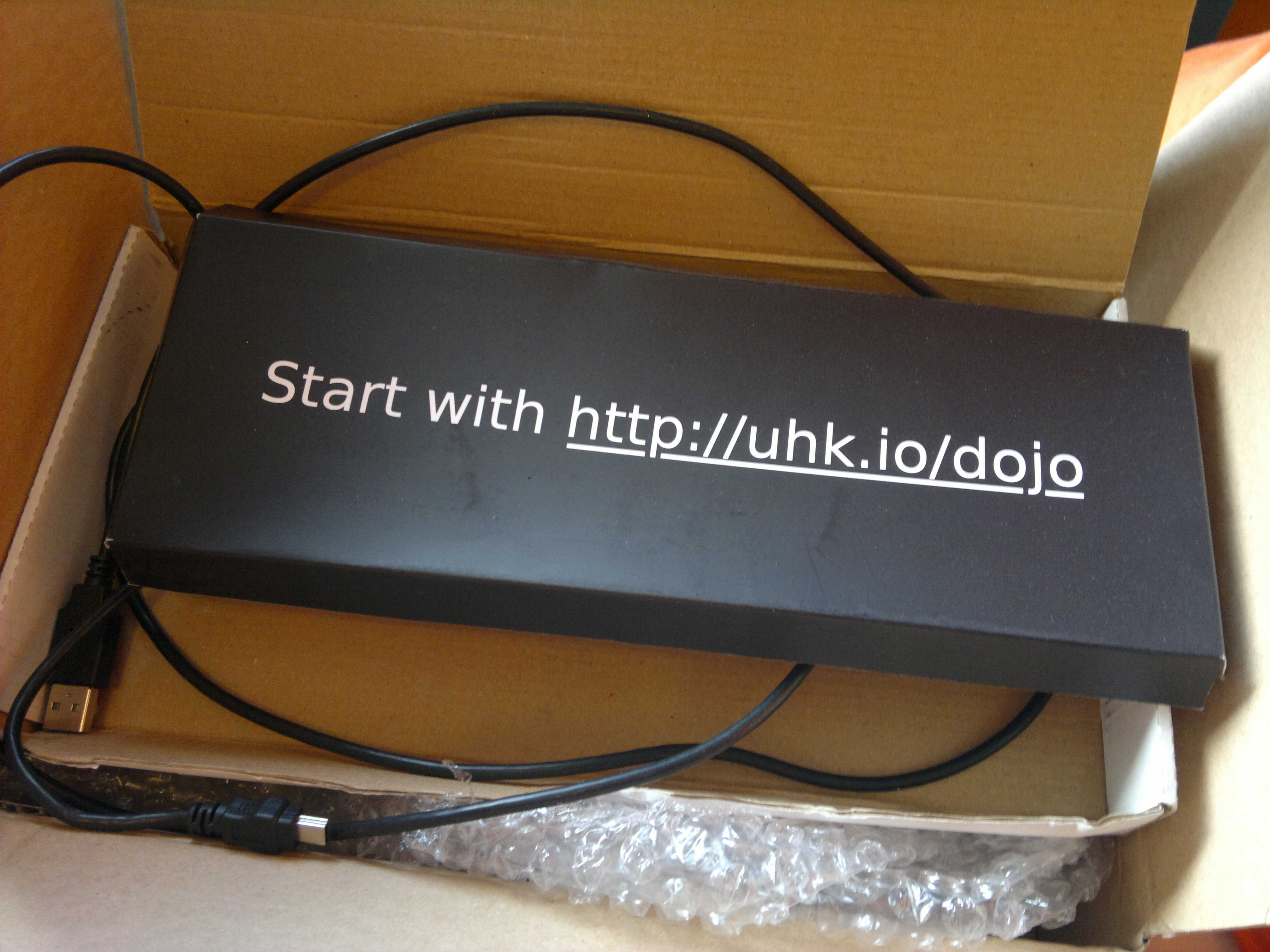 You are greeted with this URL straight out of the box so you instantly have something that will require typing for your new keyboard. For a keyboard that is a little different, this small web app is excellent at introducing the extended functions that are available to you. You can use the dojo yourself on whatever device you are using. It takes you through using the mouse layer as well as the navigation buttons and also the arrow keys.
The use of the dojo is something that adds to the excellent execution of this project. Even if you are unfamiliar with the concepts and features of the UHK, the introduction and tutorial very quickly introduces you to what you need to know and how to use it. This is a great way to introduce someone to a new layout. To the Dojo
Improvements?
I have been quite glowing in my position on the UHK. This is from a stock perspective where I see this keyboard as a product someone can buy and use off the shelf. From the current competition I think this is an incredible contender. I would like to propose some changes but also counterpoints to my own changes. The first would be smaller keys in place of the two thumb buttons. I believe the current caps are 2u or maybe. 1.75. If they are 2u then, two 1u switches would give you a lot more options. With these two additional buttons you could move backspace and enter down to the bottom row making them much easier to reach when touch typing. But I can also see that this removes some familiarity that comes with a more spacebar looking spacebar. It depends on how you see this keyboard. Already it is a split 60% which may intimate a few many people. But the gain could absolutely be worth it for how much the additional bottom row keys add in functionality.
As I have mentioned previously, I like control in the capslock position. So I would like to see it there. But I don’t see an alternative position for the mouse key which would make it as useful. Adapting to the traditional ctrl position for this keyboard felt ok as I couldn’t justify moving it back to my position.
The additional layers could also have a few more functions. For example the Fn layer is very sparse featuring only the volume controls not standard media controls. This could be a good change but it makes the learning curve that little bit more complex. I found that it suited my needs but there was the occasion where I would have liked more on another layer. This is confirmed for the final version and the entire board is of course programmable.
Having the space on both sides is convenient in some way. Despite it being there the switch type is a complete deviation from the cherry switches on the main board. This meant when I was using the case buttons I had to think about what I was doing as they just felt different. I can also see that these buttons are not really to be used too much, they provide a failsafe for if you do one specific keybind with space on the left hand (or however you have it programmed). Overall these case buttons felt unnecessary to me. The fact that I did not really like using them pushed me to conform to the UHK so it this is another show of the keyboard slightly guiding what you do and how to use it.
I like the use of the mouselayer and it is great to use on the UHK. Previously I really did not think I would like using it. Control is still missed from the capslock position. But the accessibility you are given with the mouse button where it is, still seems better than having control there. The effect the UHK has had on me should be visible here. I was fervently for control in caps lock position, but it has really opened my eyes to some alternative possibilities.
Another feature I did not think of myself using is the tab navigation. I use google chrome a lot and there is still some lack of easy keyboard navigation even through plugins. The UHK did in fact make this slightly easier. I found myself using the tab moving buttons quite a lot. This just allows you to move backward and forward through your many tabs that you have open (I have an incredible amount). But this was really the only feature of the browser stuff that I used. I already have solutions for opening and closing tabs and that is one of the few functions that are easily accessible in chrome.
Conclusion
This ties in nicely to my overall opinion of this board. I think it has been designed very well with the layout in mind at every step of the way. Both hands have access to the mods and space which makes it a lot easier to adapt to. The bottom row is featureful but not overly complicated this is the same with the layers. A lot of functions like mouse keys which are not too often included, are made simple and introduced in a way that does not require spending time learning how to start using your keyboard, but rather eases you into it. The fact that this was achieved should support how well this is designed. Having the mod keys and space both accessible from both hands makes it a little more inclusive but at the same time guides you into how you should use it.
Through extensive usage I can conclude that this is a great keyboard. What I want to change (and minimally) the keycaps and possible the layout. Both of these things can be done very easily. Besides that I really like the whole package. One thing I did not do with the prototype is change the layout. In hindsight maybe I should have done to see other options. But the reason I didn’t, was because I saw no need to.
Typing Results
These results are not to prove that the UHK will enhance your typing ability and completely change your speed. It is more proof that I did some typing on it and that it is usable.
Links to interactive chart.
Typed on The Planck
